When a packaging brief specifies compostable film or recycled cardboard, it isn't adding a limitation to the design process. It's rewriting the brief entirely, and the best work comes from designers who treat that rewrite as the starting point, not a compromise.
Most packaging redesigns still follow a familiar sequence: build the visual identity, then figure out how to make it sustainable. That order produces the cluttered, apologetic packaging many shoppers already recognize: a green leaf icon bolted onto a design that was never built to carry it. The more interesting work happens when sustainability specifications arrive first, before a single color or typeface is chosen.
Why Sustainable Materials Are Design Briefs, Not Afterthoughts
Compostable substrates, recycled board, and reduced material weight aren't finishing touches. They determine ink adhesion, surface texture, structural form, and how small type can go before it disappears into fiber texture. These are physical facts a designer must design around from day one, not specifications to accommodate later.
That constraint is clarifying. Fewer viable colors, simplified graphics, and structural limits force real prioritization instead of decorative choice. According to the Ellen MacArthur Foundation's Circular Design Guide, circular outcomes depend on decisions made at the material and structural level, not applied after the fact. A brand that treats sustainability as foundational produces a tighter visual system simply because every layer demands an intentional choice.
The Clarity That Comes From Material Honesty
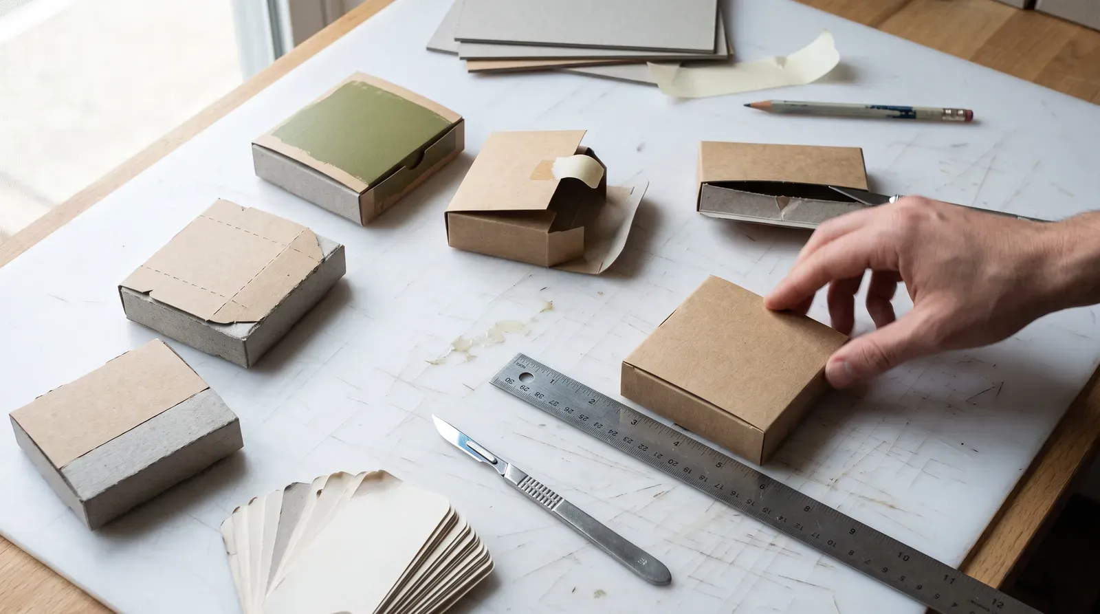
Sustainable packaging frequently exposes the material rather than hiding it: unbleached kraft, natural board tone, visible fiber. Designers who work with those qualities, instead of masking them under coatings, end up communicating brand values through the object itself. Patagonia's shift toward uncoated recycled cardboard with minimal ink coverage is a widely cited example: the packaging looks the way it does because the material dictates it, and that restraint reads as intention rather than absence.
Less print area also means logos and core typography carry more weight. When there's no room for excess messaging, what remains has to be the truth of the brand.
Structural Innovation as Strategy
The strongest sustainable packaging work treats structural change (folding methods, nesting forms, reduced cardboard footprint) as part of the brand story rather than an engineering footnote. This only works when positioning is settled before material constraints are applied. Brands that retrofit sustainability onto an existing system tend to produce visual clutter: certification marks and recycling instructions competing for space that was never designed to hold them.
The Sustainable Packaging Coalition and Packaging Technology and Research both document how real manufacturing limits, minimum ink coverage on compostable substrates, maximum print area on certain recycled grades, shape what's designable in the first place. Designers who understand those parameters early write briefs that are both coherent and producible, rather than aspirational designs that fail on the production line.
Information Hierarchy Under Space Constraints
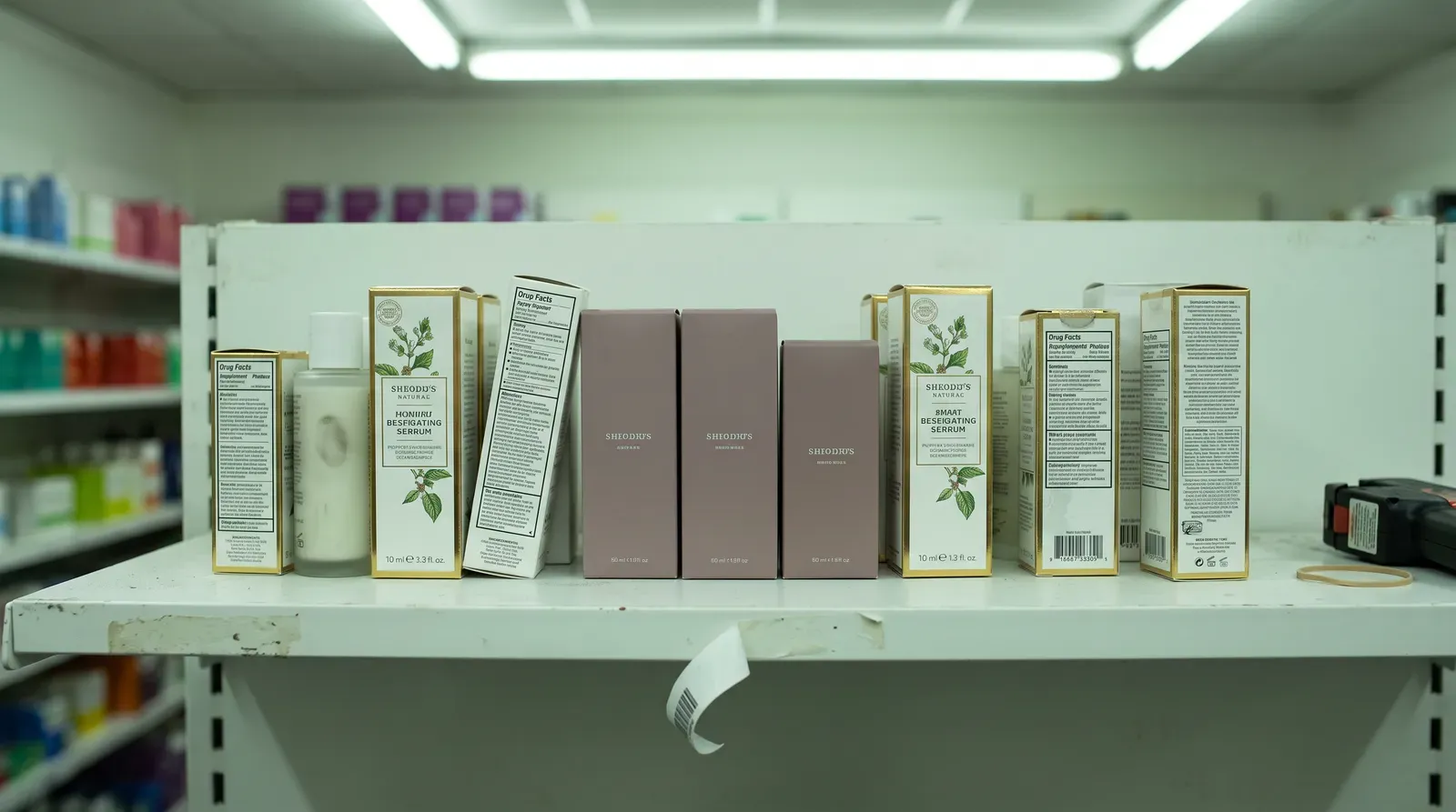
Certification marks and material composition claims, guided by standards like those from the Cradle to Cradle Products Innovation Institute, now often require primary visual real estate rather than small print on a back panel. Handled well, that information becomes part of the identity system instead of a compliance afterthought. Handled poorly, it crowds out everything else.
That pressure to compress, fewer colors, tighter copy, one dominant mark, tends to produce packaging that's more distinctive, not less. Constraint, applied early and deliberately, is still doing what it always has in design: making the essential impossible to ignore.