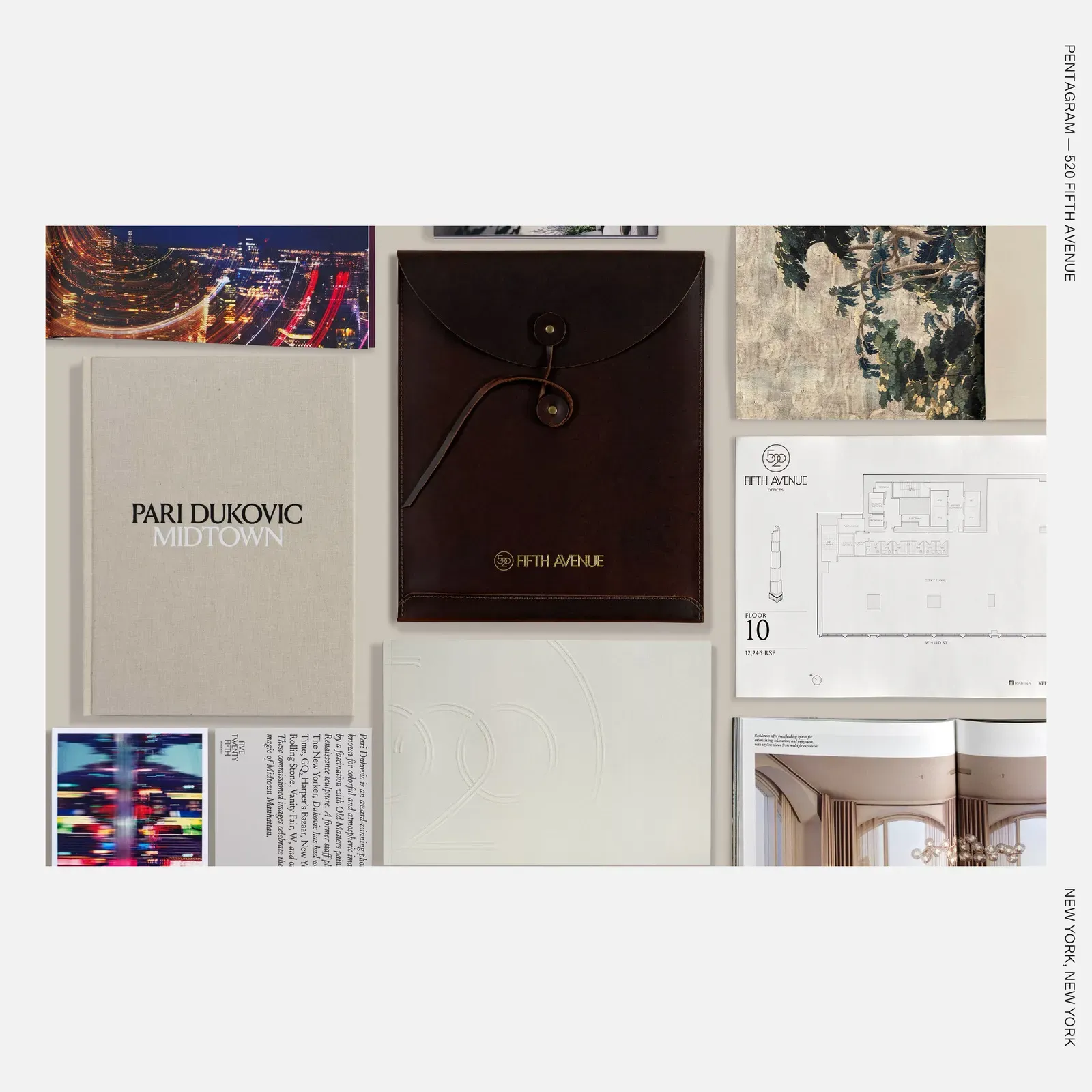
Pentagram's identity for 520 Fifth Avenue treats a Manhattan tower less like real estate and more like a title worth collecting, complete with an engraved wordmark and a debossed brochure built to the standards of a fine printed book.
520 Fifth Avenue is a 1,000-foot residential tower designed by Kohn Pedersen Fox and developed by Mickey Rabina, rising at Fifth Avenue and 43rd Street among Beaux-Arts neighbors like Grand Central Terminal and the New York Public Library. KPF answered that context with glazed terracotta arches, oversized 10-by-10-foot windows, and tiered setbacks that recall Art Deco's "wedding cake" massing. With units starting at $1.7 million, the building needed to sell more than square footage. It needed to sell belonging to Fifth Avenue's architectural history.
Branding as Cultural Positioning
Pentagram was brought in to build the full identity and communication strategy, working alongside Binyan Studios on content and rendering, and Property Platform on digital sales tools. This is branding as infrastructure, not decoration: a coherent narrative running from wordmark to app interface.
An Engraved, Deco-Inflected Wordmark
The custom wordmark borrows its geometric proportions and vertical emphasis from 1930s Art Deco letterforms, rendered with engraved linework rather than flat type. That engraving technique gives the mark tactile depth, evoking fine printing or metalwork instead of standard signage. The proportions echo the tower's own facade logic: precision over ornament, verticality over bulk. The wordmark functions as an architectural detail in miniature.
The Brochure as Object, Not Collateral
Rather than print or digital-first collateral, the primary sales brochure uses debossing, pressing the design into the paper to create recessed relief. Debossing has long signaled prestige in publishing, from art catalogs to couture invitations, because it demands custom dies and slow, deliberate finishing. Applying that technique to a real estate brochure reframes the document as a collectible object, something closer to a monograph than a flyer.
Restraint as the Real Signal
Pentagram's approach follows the same discipline evident in Michael Bierut's earlier Saks Fifth Avenue identity: typography and material choice carry the luxury signal, not color or spectacle. Negative space and hierarchy do the work that ornament would in a lesser system. That restraint mirrors Beaux-Arts logic itself, where sophistication comes from what is left out.
Consistency Across Every Surface
The wordmark repeats without variation across signage, sales suite displays for the residences, offices, and the building's Moss private club, and the Property Platform app's interactive floor plans and renderings. It behaves like an editorial masthead: one mark, applied with total consistency, holding a system together across formats.
Why It Worked
The building reportedly reached over 90 percent presales ahead of completion, per Binyan Studios' account. That outcome doesn't prove design alone drove sales, but it does suggest buyers responded to coherence: an identity that treated the building as a designed legacy rather than inventory. For any studio working on architecturally ambitious projects, the lesson is specific. Typographic craft and material investment aren't finishing touches. They're the argument.