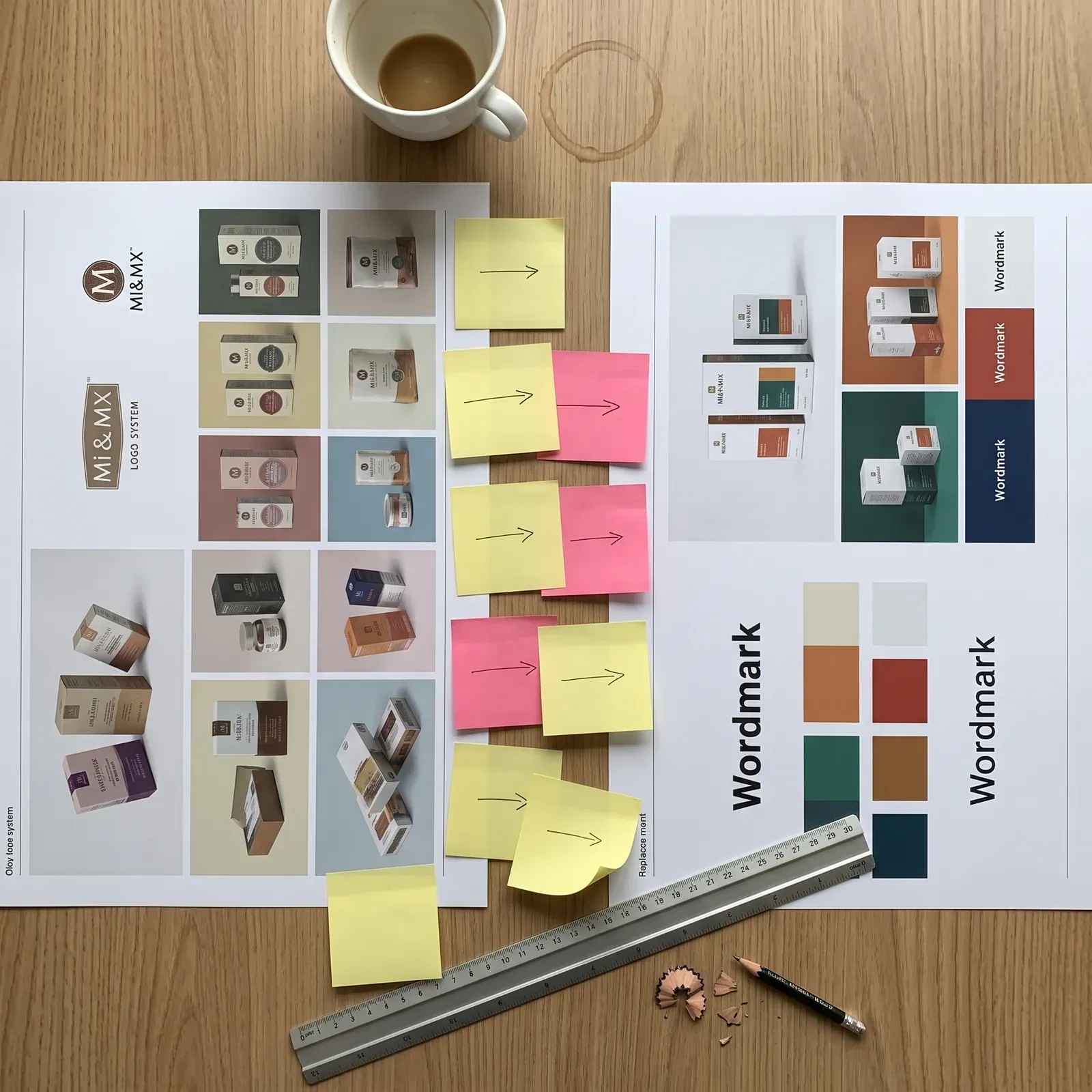
A polished new mark can win every design award and still sink the brand it was built for.
Design teams love to debate typography and color systems, but a rebrand's success rarely comes down to craft alone. The real failures usually happen around the logo, in positioning, timing, and communication, not inside it. Understanding that distinction is the difference between a designer who ships beautiful artifacts and one who ships brands that actually work.
A logo is not the strategy, it's the output of one
Brand strategy sets positioning, audience, and differentiation before any visual work begins. Identity design simply gives that strategy a visible form. If the strategic layer is thin or contradicted by context, even a technically flawless mark has nothing solid to say. A logo can be balanced, scalable, and distinctive at small sizes, and still fail if it doesn't answer the one question every audience asks: what changed, and why does it matter to me?
Case study: Gap's 2010 wordmark reversal
Gap replaced its longtime serif logo with a plain wordmark and a small blue gradient square. The backlash was immediate, and within about a week, Gap reverted to the original. The mark itself wasn't the core problem. There was no stated reason for the change, no phased rollout, and no groundwork laid with customers. The new logo simply appeared, with nothing to justify its arrival.
Case study: Tropicana's 2009 packaging redesign
Tropicana swapped its familiar orange-with-straw carton for a minimal design featuring a glass of juice. Sales dropped sharply within weeks, and the company reverted to the earlier design. This wasn't a craft failure. It was a recognition failure: the redesign removed the exact visual cues shoppers relied on to find the product on a crowded shelf.
Rollout and system failures
A logo is one piece of a larger identity system: typography, color, imagery, tone, and application rules. Rebrands often fail when that surrounding system is incomplete or inconsistently applied, or when internal teams and customer touchpoints aren't aligned before launch. Byron Sharp's research on distinctive brand assets shows recognition depends on consistent, repeated use over time. Reset those assets without a transition plan, and you sacrifice earned recognition no matter how strong the new mark is.
The narrative gap
Gap and Tropicana share one structural flaw: both redesigns landed as finished artifacts with no explanation attached, leaving audiences to judge only "do I like this better." Rebrands introduced alongside a clear rationale, like a merger or a documented strategic shift, get evaluated differently before design even enters the conversation. For creative teams, that means rollout narrative and sequencing are part of the design problem, not a marketing task bolted on afterward.
What "the logo was great" actually obscures
Design critique often praises geometry, typography, and color choices independent of whether a rebrand achieved its actual goal. A mark can be original and well-crafted and still fail if it doesn't reflect a real shift in the business or erases equity customers depended on. Blaming "the logo" when the real cause is strategic or sequential leads teams to over-correct on craft next time, instead of fixing the process that broke.
Before your next identity project kicks off, map the story and rollout plan with the same care you give the mark itself. The strategy carries the brand. The logo just carries the message.